
Skip to content
Catalyst Performance

The Catalyst Performance logo: One cycle, 1,547 dots

The Catalyst Performance logo is one training cycle: a climb, a peak, a long dip and a higher climb, drawn in dots. One session is a dot. Keep showing up and you get the line.

Read the four beats

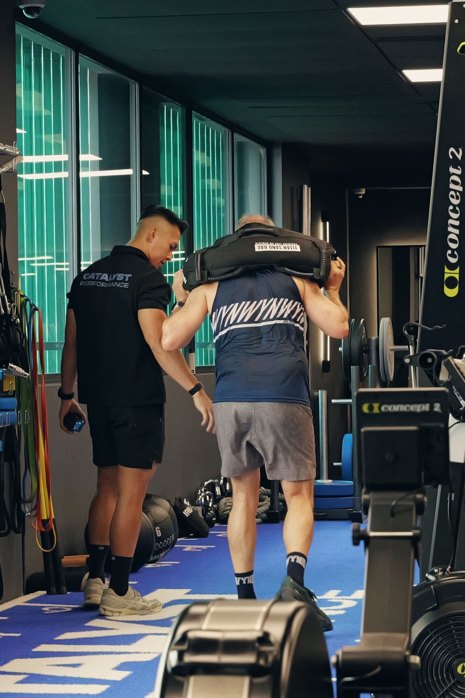
A Catalyst coach walks beside an older member carrying a sandbag across the training floor

What the logo says

Every dip builds the next peak. Every peak is higher.

The line is about a trajectory, not a promise. Capacity declines with age; that is true, and the logo does not hide it. Training holds the line higher, for longer, than it would otherwise sit. Higher means higher than where you would otherwise be.

The four beats

Every training cycle has the same shape. You load the body, you tire, you recover, and you return able to do a little more. The mark draws one cycle of it, in four beats. Scroll, or choose a beat, to light that part of the logo.

The steep opening stroke is adaptation: the body rebuilding above where it was. It is where the line rises fastest.

The top edge leaves the left tip at 21 degrees, then steepens on the way to the peak.

One session, one dot

Newspapers once printed photographs as thousands of small dots. Up close you see only dots. Step back and you see the picture. Training works the same way: no single session is the result. The result is what the sessions make together.

All 1,547 dots. Step back, and you see the line.

That is what the dots mean to us. A missed week is a few dots, and the line still reads. The line was drawn first; the dots came later. The crest is light and the underside is Steel Blue, so the line has a top and a weight, the way a body does.

A client presses two dumbbells on an incline bench while a coach spots him at Catalyst Performance
One session at the studio: one dot.

The space in between

Look at the two edges of the logo: two lines from the same start. The lower one is the line you would follow on your own. Plenty of people train well alone, so that line can rise too. The upper one is the line you follow with us.

We are the space in between and we uplift your journey

Each dip sized on purpose, each recovery made to count. Train alone and you set every dip yourself. With Catalyst, we set them with you.

You are the higher line

The drawings

Five plates hold every rule of the mark: its dimensions, the dots, its layers, the lockup and the sizes where the dots give way to solid. Every figure comes from the master file.

  1. Dimensions: The master mark on its 24-unit grid: 22 units wide, 6.7 high, the peak at 35.5% of the width and a net rise of 40% of the height. Four joins are smooth; the two tips are sharp.

    Dimensions

    The master mark on its 24-unit grid: 22 units wide, 6.7 high, the peak at 35.5% of the width and a net rise of 40% of the height. Four joins are smooth; the two tips are sharp.

  2. The dots, up close: One size of dot on a 45 degree grid, cut at the exact outline. The crest takes the ink colour and the underside takes Steel Blue.

    The dots, up close

    One size of dot on a 45 degree grid, cut at the exact outline. The crest takes the ink colour and the underside takes Steel Blue.

  3. The layers: The logo taken apart, from the grid to the underside dots. A concept drawing: the layer spacing is for reading, not a measurement. Switch to see the layers together.

    The layers

    The logo taken apart, from the grid to the underside dots. A concept drawing: the layer spacing is for reading, not a measurement. Switch to see the layers together.

  4. The lockup: The symbol sits left of the name. The peak meets the CATALYST cap line, the left tip meets the PERFORMANCE baseline, and clear space is one cap height on every side.

    The lockup

    The symbol sits left of the name. The peak meets the CATALYST cap line, the left tip meets the PERFORMANCE baseline, and clear space is one cap height on every side.

  5. Cuts and sizes: Three cuts of one mark, for screens, small sizes and embroidery. Below 128 pixels the dots blur, so small sizes use the solid mark.

    Cuts and sizes

    Three cuts of one mark, for screens, small sizes and embroidery. Below 128 pixels the dots blur, so small sizes use the solid mark.

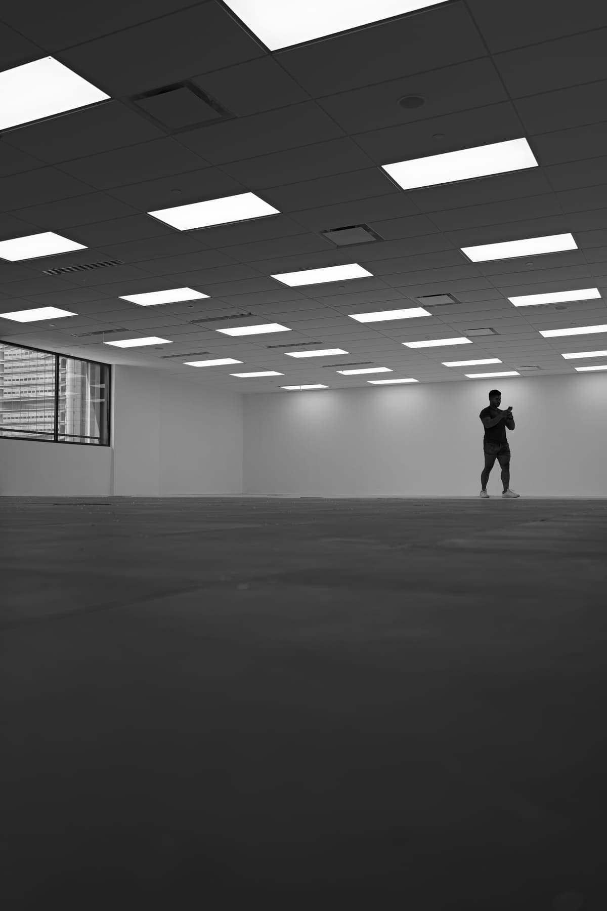
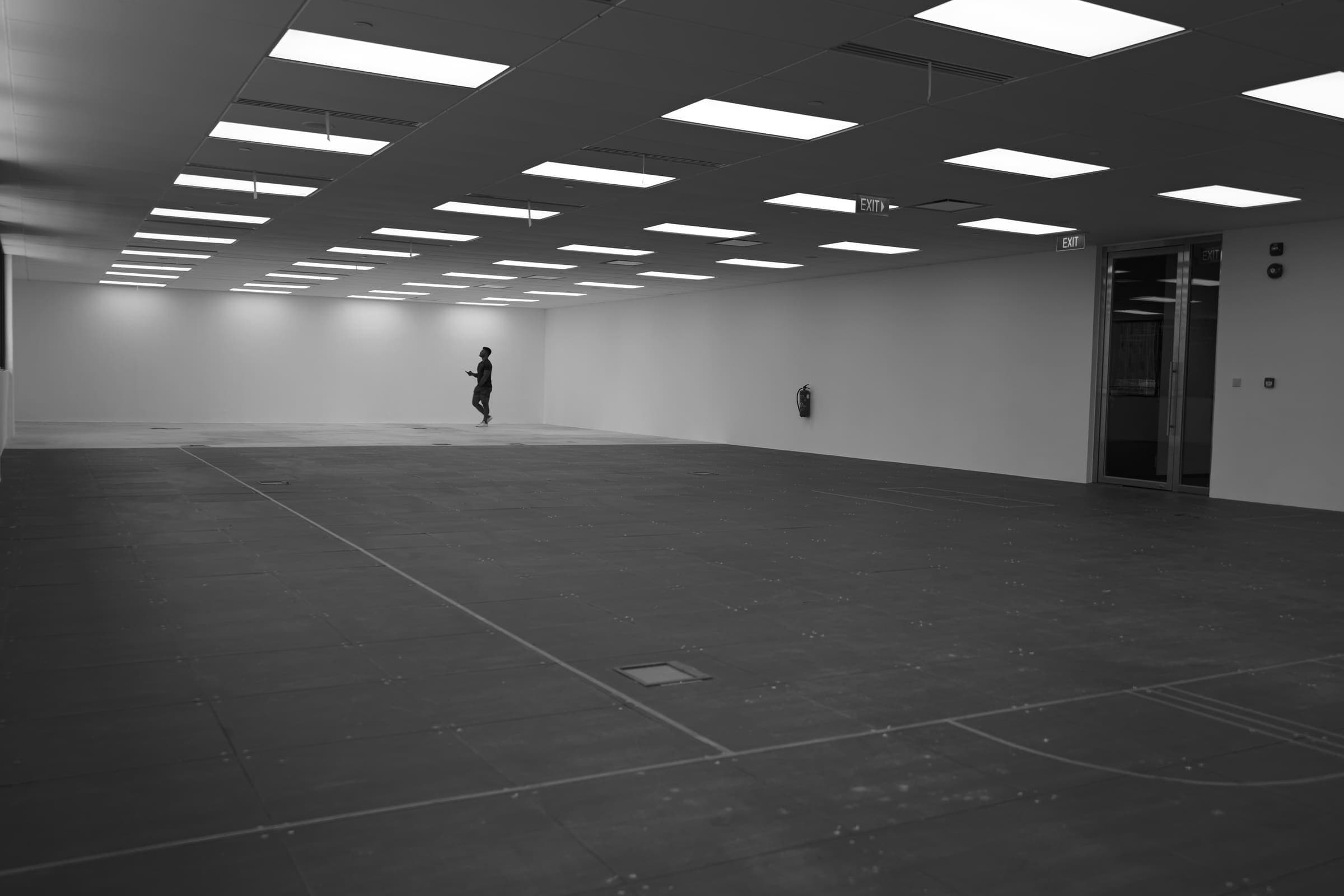
The empty unit at Manulife Tower before the fit-out, one person standing at the far wall under the ceiling lights

How we came to it

The logo took over a year, and the studio is one year old. Both are true.

  1. Before the studio

    Only an idea

    The thinking started when Catalyst Performance was only an idea. The studio is one year old; the logo took longer than that.

  2. The first drawing

    A chemist's diagram

    It began as a chemist's diagram of a catalyst at work. It became something else: the line now follows a person.

  3. 30 October 2026

    The artwork, approved

    The team's final artwork was approved, then rebuilt as a master shape so that every file comes from one drawing.

  4. The same week

    Five rises, one chosen

    The first trace rose 26.5%. We tried 27%, 33%, 36% and 40%, at 32, 68 and 264 pixels wide. We chose 40%.

  5. 30 and 31 October

    Then the dots

    The line came first. The dots came after, and became the primary logo, the one we go live with everywhere.

  6. November 2026

    One year, one line

    The logo went public the week the studio turned one.

Logo questions

Q. 01

What does the Catalyst logo mean?

The Catalyst Performance logo is one training cycle. A steep climb, a peak, a long dip and a turn up into the next climb, which starts higher than the last. The client is the line. Catalyst is the force behind it.

Q. 02

Why is the logo made of dots?

One session is a dot. Keep showing up and you get the line. That is what the dots mean to us. The line was drawn first, and the dots came later.

Q. 03

Is every peak really higher?

Not literally, and not at every age. Capacity declines with age, and an injury can lower a peak. The line is about a trajectory: training holds the line higher, for longer, than it would otherwise sit. It is never a promise of a result.

Q. 04

Is the dip a setback?

No. The dip is the next block of training, the planned load that makes the next peak possible. A coach sets the size of each dip and makes each recovery count.

Q. 05

Is this the science of training cycles?

It draws a simplified model that coaches use to plan training, called supercompensation: you load, you tire, you recover, and the aim is to come back a little higher. We never print a timetable for it.

Q. 06

When is the solid logo used?

Where dots do not work: below 128 pixels, favicons, embroidery and one-colour print. Everywhere else the logo is the dots.

The logo draws the long game we train for. Read our manifesto and the four pillars we measure.

Start your line

The client is the line. Catalyst is the force behind it. It starts with one session: the 4-Pillar Healthspan Assessment measures where your line sits today, across body composition, cardiorespiratory fitness, stability and strength.

All four pillars, 60 minutes, Manulife Tower.